WE’RE DOING CONSTRUCTION
PLEASE IGNORE THE DUST
****Bear with me while I update my work! Lots of exciting things to come.
CRESIMO
Package Design
Cresimo, a leader in the world of premium barware and coffeeware storage products came to REIT requesting our help to create a cohesive visual identity across Cresimo’s family of brands. The Cresimo team wanted the new packaging to be recognizably fun, in hopes that it’d evoke this feeling of “magic”.
Cresimo offers many products across a variety of spaces - from that fancy French press that your bestie served you coffee from to the shaker that the bartender down the road uses to make your favorite cocktail.
We really needed to put our thinking hats on and come up with ways to visually distinguish a unique look and feel for each individual product that also make sense for the brand as a whole.
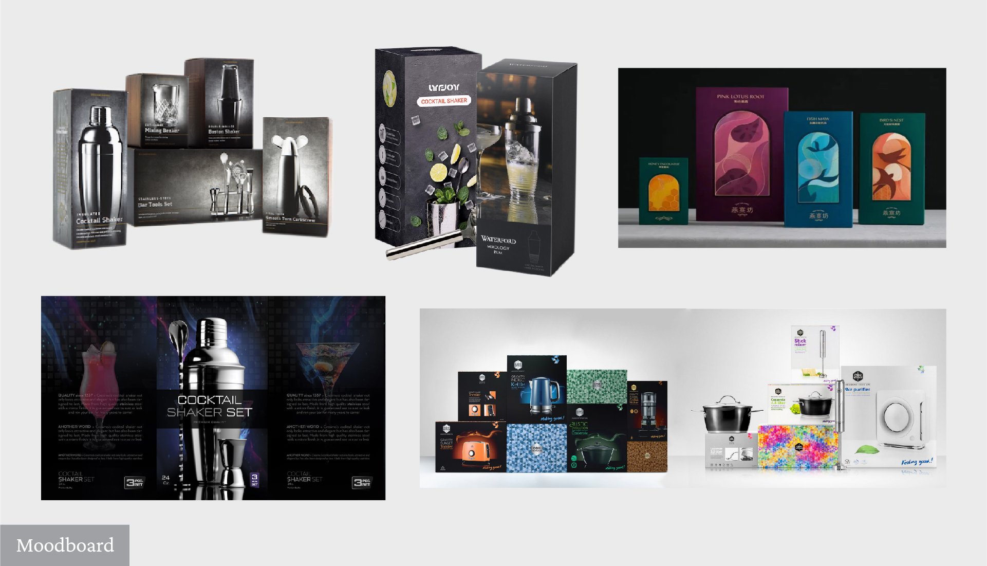
We started with a simple moodboard.
As a team, we came up with some aspirational questions to help us get a full grasp on what the Cresimo teams goals were once their new packaging was put into the world. In addition to doing research on Cresimo’s top competitors, we used their answers to our questions to find visual inspiration. This helped us get the creative juices flowing on both ends, and we got a better understanding of their likes vs dislikes based on how the Client reacted to different styles of creative.
We knew they wanted “magic”. Now, we need to take that metaphorical feeling into the physical realm.
We took a look at the visual experience as a whole. Packaging is a 3D world, it’s a physical “advertisement” of the product living inside and we wanted to make sure that we were hitting every touchpoint. We wanted to ensure that every time a Cresimo customer physically picked up the product in it’s box, the experience was engaging and magical.
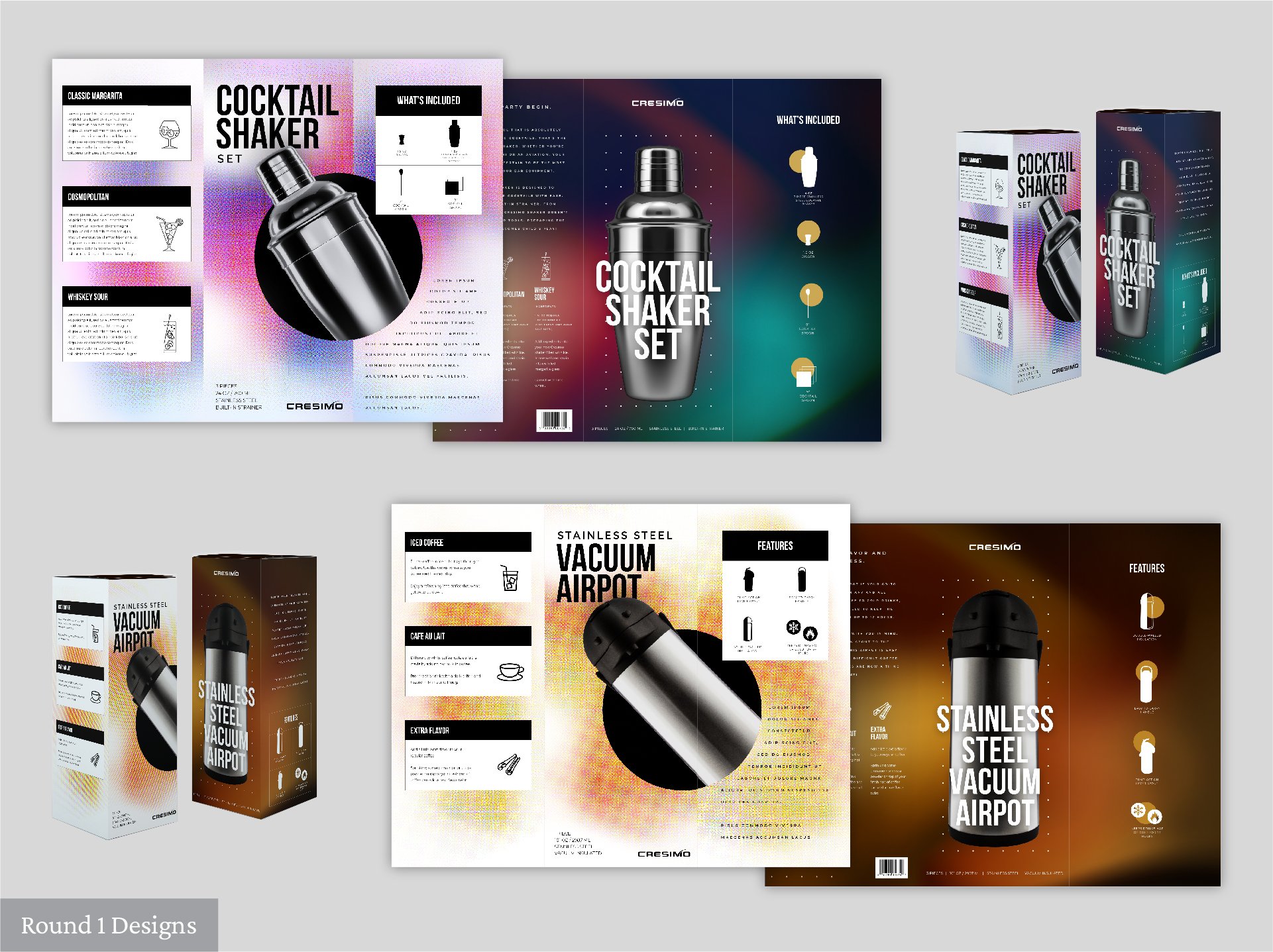
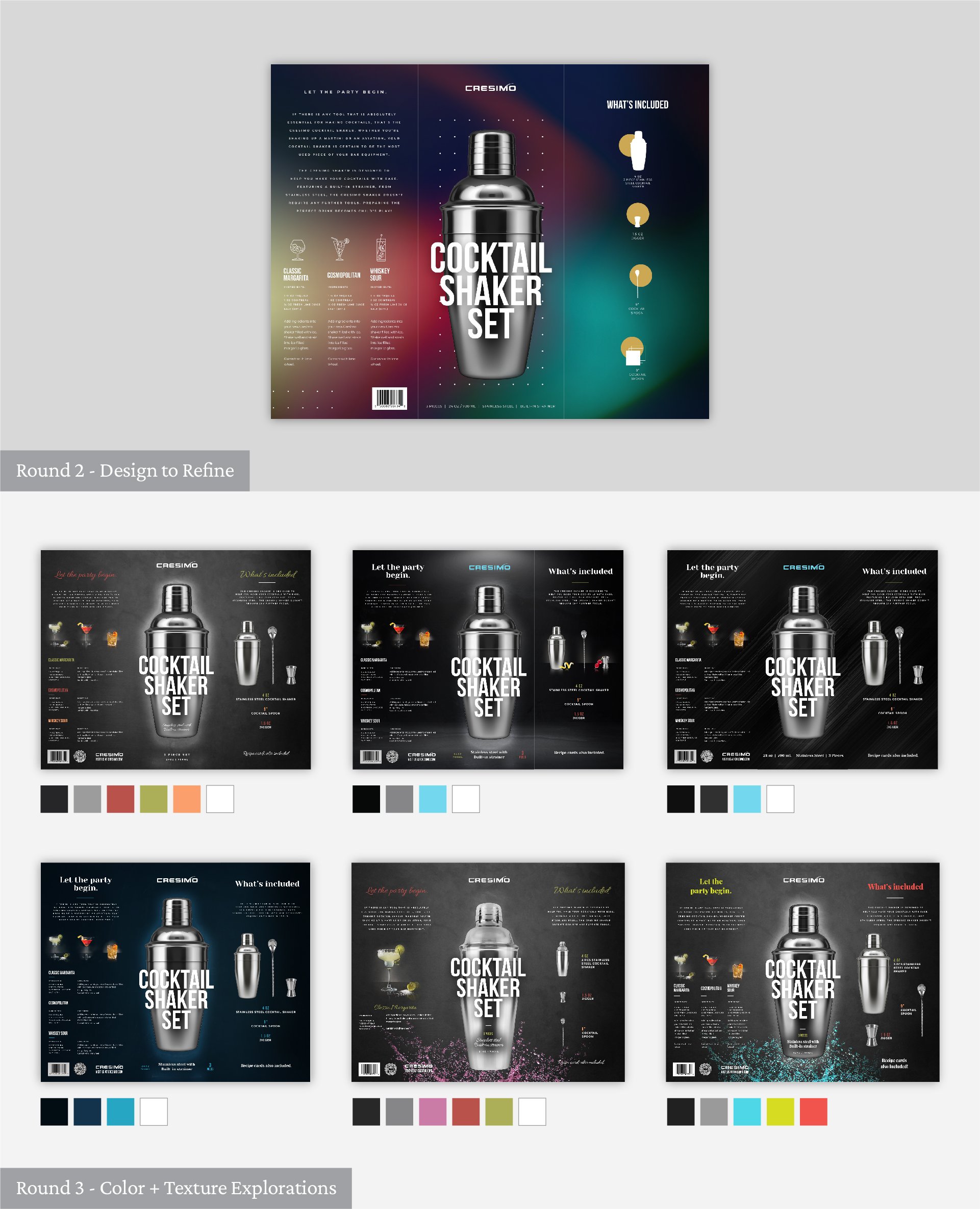
Our round 1 designs were full of life. They were colorful, deep, mysterious and most of all, they were fun.
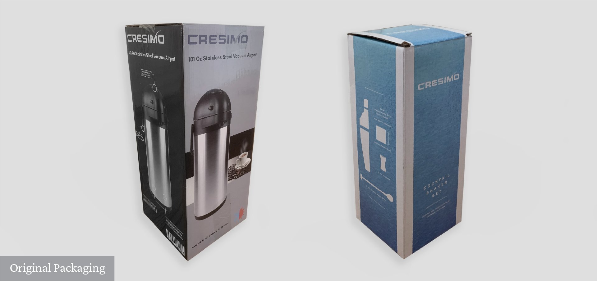
The brands original visual identity and packaging varied from one product to the next.
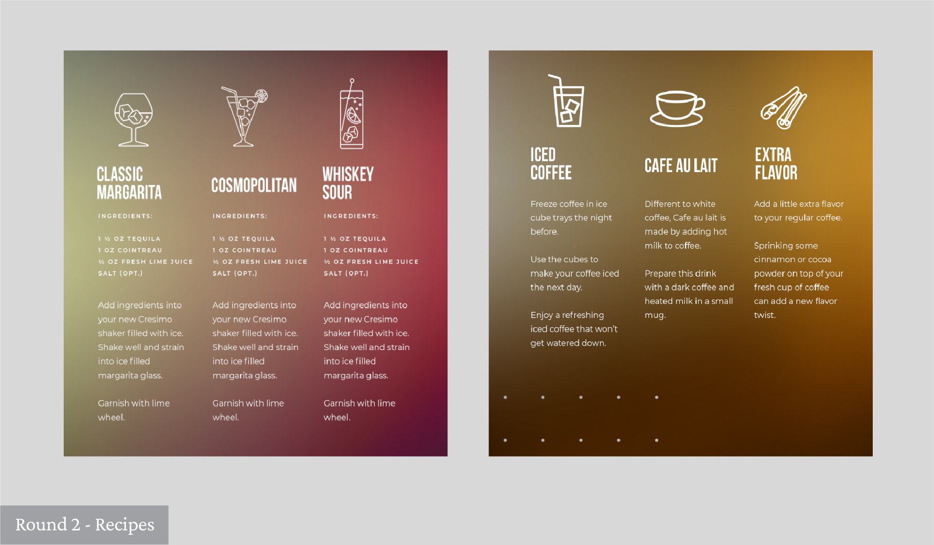
To take it up a notch, we came up with and added recipes to each package. A great gift idea for those just getting started with at-home signature cocktails or for veteran coffee makers interested in crafting an elevated treat, but also a really simple way to engage a customer trying to choose between one product and another.
Now, as we know, in addition to being a visual experience, product packaging is also massively physical. The viewer is scanning the aisles of a store to choose a product of their liking. They may pick up the package and examine and more than likely, they’re going to go with the designs that make them feel something. This opens a whole new world of opportunity.
We worked with Cresimo to create designs that feel “cool” to the touch (and to the eye!) while bringing the Cresimo brand to life. The Client was unsure about the color pallet that they wanted to move forward with, so we played around with colors and textures in R2. Using Client feedback from R2, we presented a new set of designs. We played with color and texture.
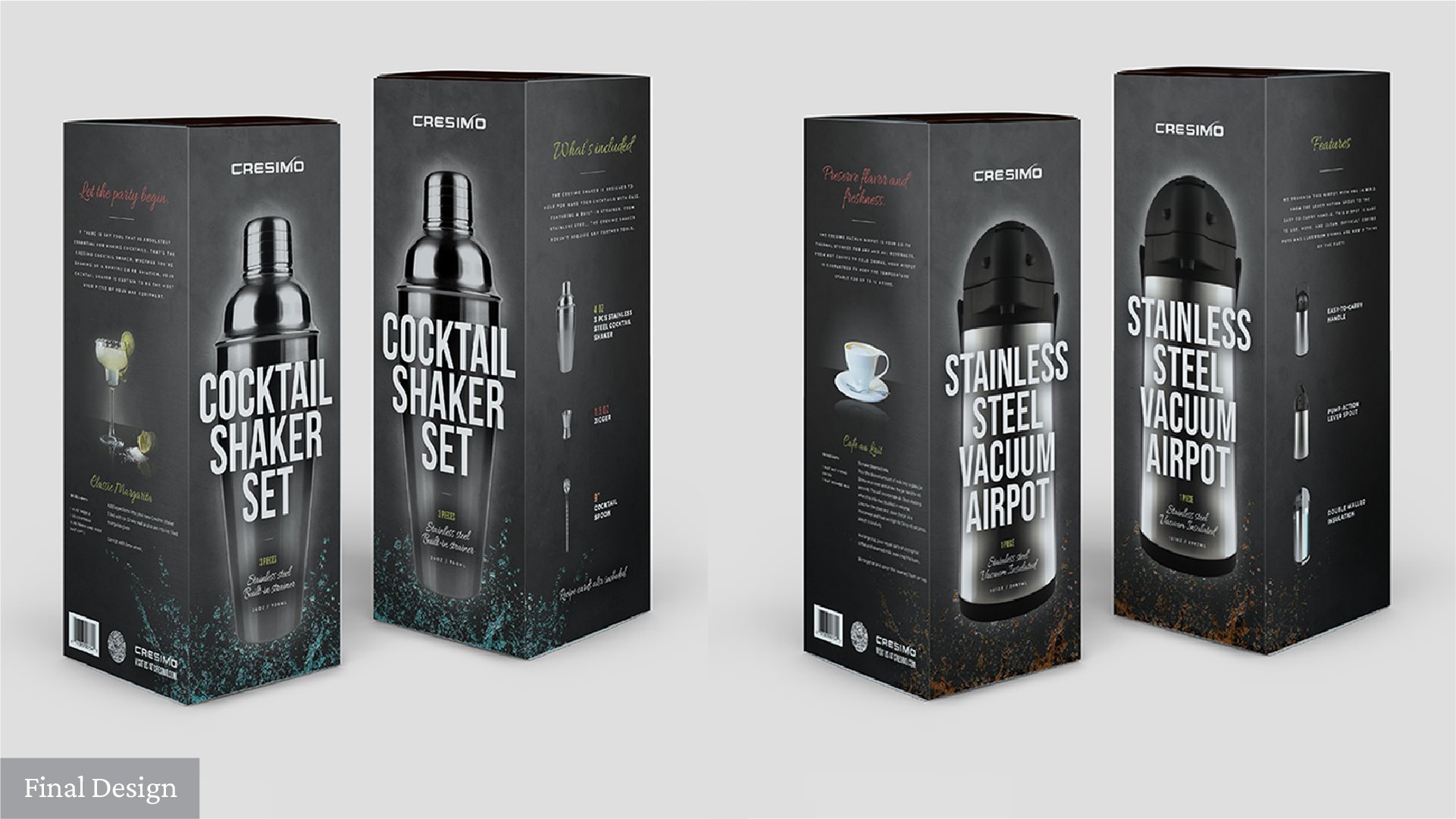
The product glow and the colored liquid splash in our R3 presentation really struck a chord with team Cresimo. We were getting really close. The team wanted us to combine the glow and the liquid, and to play with a color pallet that feels “otherworldly”.


